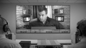
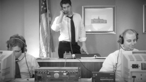
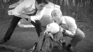
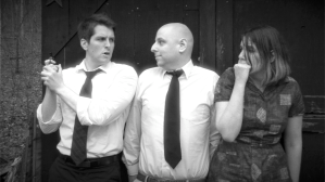
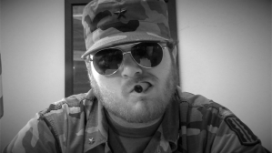
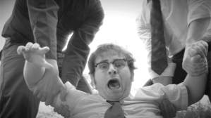
One of the more constant compliments we get about our movie (aside from “yay! it’s short!”) is on the look of the thing. Critics have written about how solid the black and white image looks; fans have told us how much they dig it. And everybody wants to know: how did we get such good lookin’ monochrome in the modern age?
That’s simple: we cheated.
When we started filming, we were mostly sure we wanted to go black and white, but we also wanted to hedge our bets if something wound up looking really good in color (or if we simply changed our minds). And so we shot in color.
It didn’t hurt that shooting in color made filming easier. The camera and digital video tape, being modern equipment and all, defaulted to color, and we didn’t have to spend any extra time thinking about any in-camera conversion. Shooting in color also made effects work easier, what with that green screen needing to be green and all.
Somewhere around this time last year, we pulled the trigger and formally decided to go black and white for the final cut. Sure, some of the decision was to help save time (converting to black and white wound up being so much faster than color correcting every shot, one by one), and some of it was to help hide the flaws in production (a few green screen shots had some rough edges in color, but those edges disappeared in the black and white version). But most of it was because we just like black and white and felt the movie worked best as an oddball throwback if we ditched the color.
(Side note: the decision to shift abruptly to full color for the closing credits was made somewhere around the time we recorded the theme song. It just fits.)
Final Cut Pro has some decent choices for color conversion, but they tended to look a bit flat; our shot-on-video image still looked shot on video. Luckily, Matt found a killer plug-in from a company out of Poland called motionVFX. (Yup, Inhumanwich! is officially an international production. Sort of.) The plug-in, New Noir (part of their mLooks plug-in, and no, we weren’t asked to shill, we just wanted to share the love), was so perfect for our needs, a simple drag-and-drop was all that was needed. The expected need to tweak the filter levels on some scenes never materialized; each shot looked the way we wanted. (A nifty bonus was the hazy glow and dollop of grain the filter adds, which we didn’t know we wanted until we saw it.)
For comparison, here are some “before and after” shots (click to enlarge):
So, yeah. Next time you read a review that mentions the slick black and white photography, just remember: we cheated.
Don’t tell.


